Global COVID-19 & GDP Analysis
This project analyzes a 184-country dataset that combines COVID-19 burden with IMF-linked GDP and GDP-per-capita indicators. The work moves from global comparisons into correlation analysis, regression diagnostics, geographic mapping, and a Random Forest mortality model.
The clearest story is that totals and per-capita rates describe different realities. Large countries and large economies dominate raw counts, while per-capita views expose a different geography of impact and make country context much more important.
Technologies Used
Project Focus
The notebook is built around population, total cases, cases per million, total deaths, deaths per million, GDP, and GDP per capita. That makes it possible to compare raw burden, normalized burden, and model behavior without changing datasets midway through the analysis.
The project works best as a global analytics case study with a modeling extension. The ML is useful here because it clarifies what the visible signals explain well and where the most severe countries still break pattern.
Dataset Snapshot
The file contains 184 country records, 9 columns, and no missing values. Most of the numerical fields are strongly right-skewed, which means a relatively small set of countries drive a large share of the visible variation.
Total cases and total deaths move together very strongly across countries.
GDP is much stronger than population alone for explaining total case counts.
GDP per capita becomes useful once the target shifts to cases per million.
The mortality model captures baseline patterns but still misses the most extreme countries.
Core Readout
The notebook supports two connected conclusions. Raw totals behave mostly like a scale story, while relative burden is more tied to reporting intensity, infection spread, and country-level context that simple size measures do not capture.
| Signal | Value |
|---|---|
| Total Cases to Total Deaths | 0.90 corr. |
| GDP to Total Cases | R2 0.586 |
| Population to Total Cases | R2 0.135 |
| GDP per Capita to Cases per Million | R2 0.443 |
| Random Forest to Deaths per Million | R2 0.505 |
Interpretation
Totals reflect scale
Large countries and large economies dominate total cases and total deaths.
Rates expose intensity
Per-capita views reveal a different cross-country pattern than the raw totals do.
Outliers reveal hidden structure
High-mortality countries are where the current feature set stops being enough.
Global Burden
The first step is separating absolute burden from relative burden. That distinction matters because the countries leading raw totals are not always the same countries carrying the heaviest burden per person.
Top Countries by Total Cases
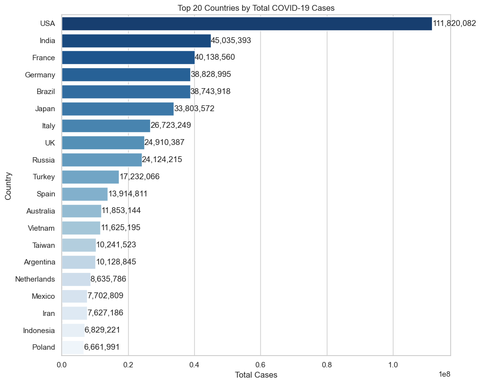
Raw totals are concentrated in a small set of very large countries, with the United States far ahead of the rest. This is a useful baseline, but it mainly reflects scale.
Cases per Million Leaders
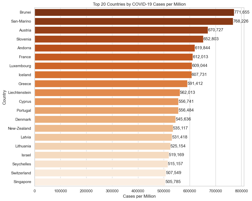
Once the data is normalized, the leaderboard changes substantially. Smaller countries can show much higher relative burden even when they never dominate raw totals.
Global Choropleth
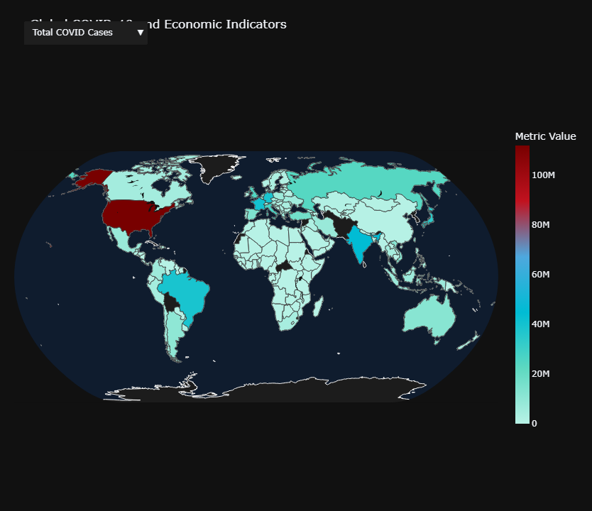
The map makes that metric shift easier to read. High total counts cluster around the largest countries, while high mortality rates appear more concentrated across Europe and parts of South America.
Global Bubble Map
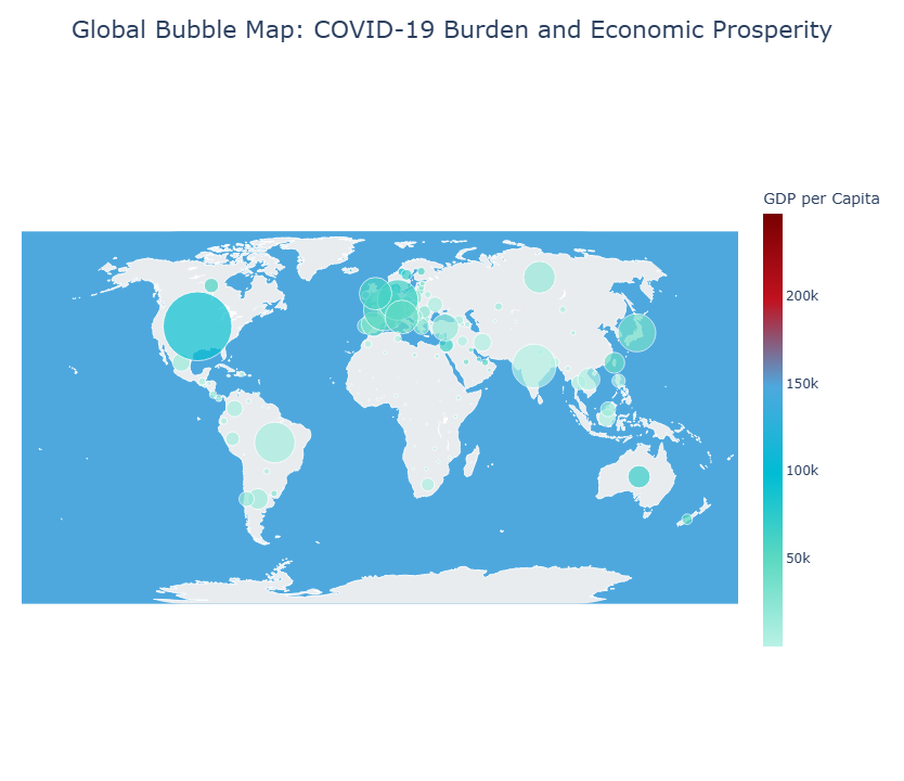
This view layers outbreak scale and prosperity together. It is one of the clearest visuals for why wealth and reported burden can rise together without implying a simple causal story.
Relationship Structure
Before modeling, the key job is to identify which variables move together and which only become useful once the target is framed correctly.
Correlation Heatmap
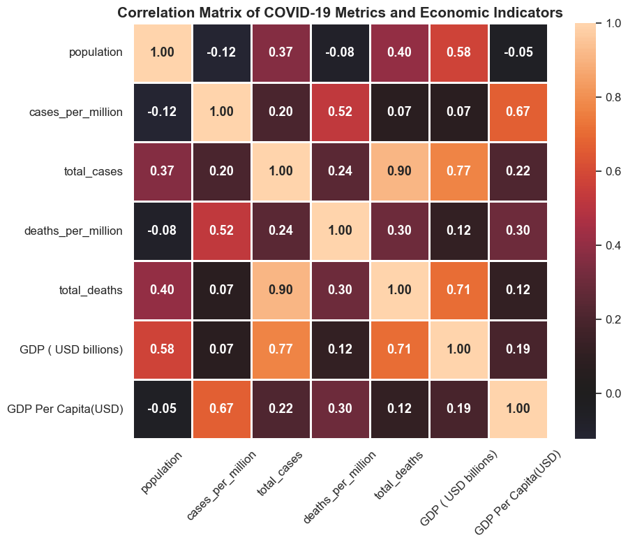
The heatmap is the organizing chart for the whole project. Total cases and total deaths are tightly linked, GDP tracks raw burden strongly, and GDP per capita lines up more with cases per million than with raw totals.
Key Relationships
`Total cases to total deaths = 0.90` is the clearest structural relationship in the dataset, which tells us spread explains a large share of raw mortality burden.
`GDP to total cases = 0.77` and `GDP per capita to cases per million = 0.67` show that economic signals matter, but in different ways depending on whether the outcome is absolute or population-adjusted.
`Cases per million to deaths per million = 0.52` is meaningful without being complete, which is why mortality cannot be reduced to infection rates alone.
Regression Read
The linear models work best as explanatory tests. They help separate strong signals from weak ones and show where the global dataset becomes too skewed for a simple clean fit.
Population vs Total Cases Residual Pattern
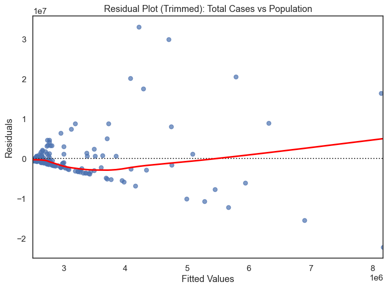
Population matters, but only weakly on its own. The fan-shaped residual pattern shows that error grows as fitted case counts grow, so a simple population model becomes less reliable for larger, more complex countries.
GDP per Capita Diagnostics for Cases per Million
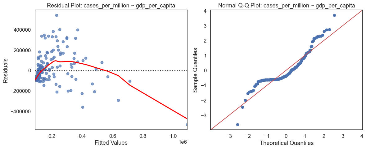
This is one of the more useful linear relationships in the notebook. GDP per capita explains a meaningful share of per-capita case burden, but the residual and Q-Q plots still show curvature, skew, and outlier-heavy behavior.
Mortality Modeling Extension
The Random Forest mortality model is a supporting layer rather than the main event. It is helpful because it captures baseline mortality structure, ranks countries by relative risk, and shows exactly where the current variables stop being enough.
Actual vs Predicted Deaths per Million
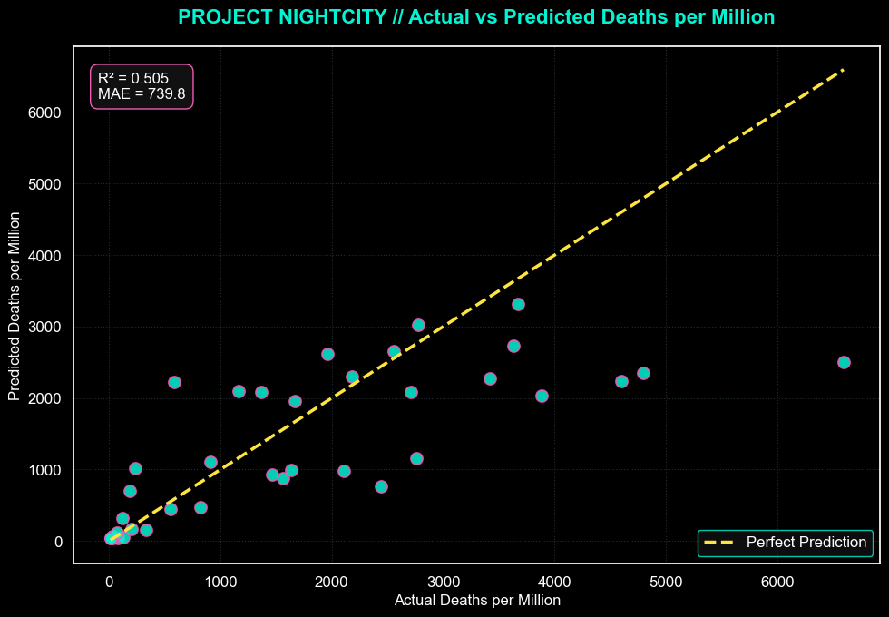
The Random Forest model captures the overall mortality trend with moderate predictive power. It is strongest in the middle of the distribution and regresses the most extreme countries back toward the mean.
Residual Error Field
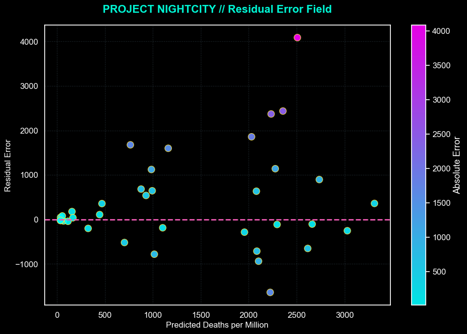
Error rises with mortality, which means the model struggles most in the highest-severity countries. That heteroscedastic pattern is one of the most useful results on the page because it tells us where the missing structure lives.
3D Mortality Prediction Space
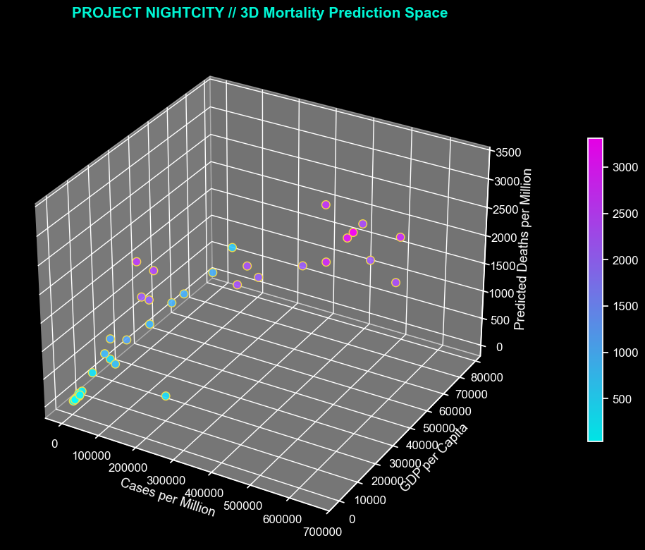
This plot makes the interaction story easier to read. Predicted deaths per million rise most sharply in countries combining higher infection rates with stronger economic scale.
SHAP Summary
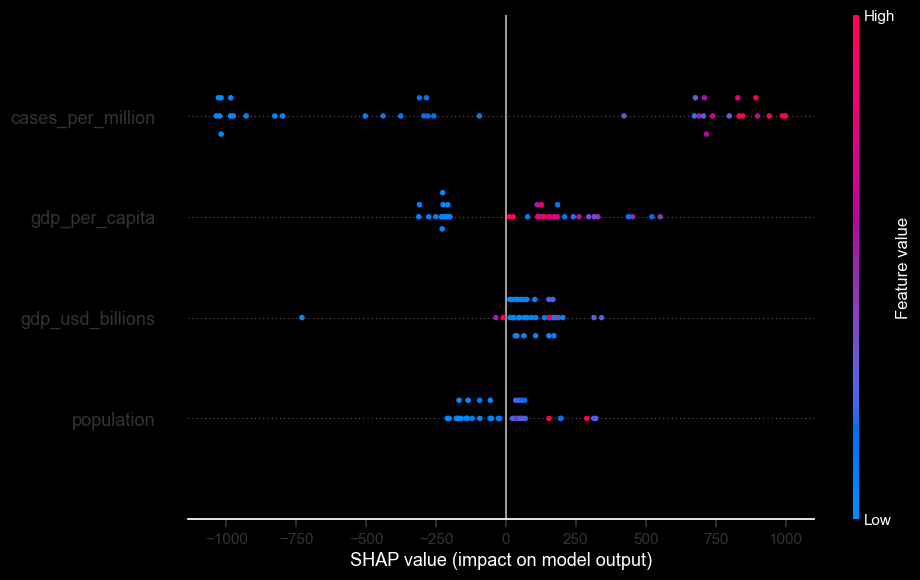
The SHAP summary shows that cases per million is the strongest driver in the Random Forest model, with GDP per capita also contributing meaningfully. That means the model is picking up infection severity plus country context, not one naive driver.
Data Needed To Explain The Outliers
The countries the Random Forest model misses most are the ones where broad country-scale and economic variables stop being enough. To explain those outliers better, the next dataset needs more direct measures of demographic vulnerability, health-system stress, and timing.
Population Age Structure
Median age, share of population over 65, and age dependency ratios would help explain why countries with similar infection rates can experience very different death rates.
Healthcare Capacity
Hospital beds per capita, ICU capacity, physician density, and healthcare spending would give the model a more direct read on whether severe outbreaks could be absorbed or overwhelmed.
Testing And Reporting Intensity
Testing volume, test positivity, excess mortality, and reporting quality indicators would help separate true burden from differences in detection and transparency across countries.
Vaccination And Immunity Timing
Vaccination rates, booster coverage, and rollout timing would help explain why some countries break away from the expected mortality pattern.
Policy Response And Mobility
Stringency indices, lockdown timing, mobility data, and border restrictions would capture the behavioral and policy responses that raw GDP and population cannot represent on their own.
Underlying Health Risk
Comorbidity prevalence such as obesity, diabetes, cardiovascular disease, and smoking rates would help explain why mortality can spike even when the visible outbreak variables look similar.
The strongest conclusion is that COVID mortality is not explained by infection rates alone. Cases per million provide the baseline signal, but economic and systemic context shape how that burden turns into reported mortality, especially in the highest-severity countries.
Notebook Trace
Data Profiling
The notebook starts with file loading, shape checks, missing-value checks, summary statistics, and distribution plots across the numerical variables.
Global Comparisons
Top-country charts compare total cases, cases per million, total deaths, deaths per million, GDP, and GDP per capita to separate raw scale from adjusted burden.
Inferential Analysis
The middle section builds a correlation matrix and runs simple OLS regressions with residual and Q-Q diagnostics to test which relationships hold up statistically.
Modeling Layer
The final section adds map views plus a Random Forest regressor for deaths per million, followed by feature-importance, SHAP, and model-diagnostic visuals.
Project Highlights
Global Country Dataset
Works from a 184-country dataset combining COVID burden, population, continent, GDP, and GDP-per-capita measures with no missing values.
Heatmap & Regression Analysis
Uses correlation analysis and regression diagnostics to compare how population, GDP, and GDP per capita relate to total and per-capita pandemic outcomes.
Interactive Map Layer
Builds choropleth and bubble-map views so the same dataset can be read geographically, not just through ranked charts and tables.
Mortality Model
Adds a Random Forest regressor, SHAP-based interpretation, and error diagnostics to show what the visible signals explain well and where the extremes still break the fit.