Adult Income Demographic Analysis
This project analyzes the Adult income dataset to understand how demographic, education, work, and hours-based variables relate to income brackets. The notebook is centered on exploratory analysis, class balance, and pattern discovery rather than predictive modeling.
The strongest takeaway is that income is not driven by any single factor. Instead, the patterns in the notebook point to a combination of education, work structure, demographic position, and a few high-signal financial variables such as capital gain.
Technologies Used
Project Focus
The notebook works from the classic Adult census-style income dataset with age, work class, education, marital status, occupation, relationship, race, sex, capital gain/loss, hours-per-week, native country, and income bracket.
The analysis asks which demographic and socioeconomic variables appear most closely associated with the two income groups, and which distributions or category splits are most useful for understanding the structure of the dataset.
Dataset Snapshot
The original dataset contains 32,561 rows and 15 columns. The notebook reports no missing values after the preprocessing checks, flags duplicate rows, standardizes categorical spacing, and removes unused columns before deeper analysis.
About 76% of records fall at or below $50K and 24% above $50K.
Doctorate and Masters levels show much higher proportions of >$50K outcomes than lower education groups.
No null values are reported after the notebook's cleaning checks.
This project is strongest as a pattern-discovery and segmentation-style analysis page.
Income Structure Readout
The dataset is meaningfully imbalanced, which matters for any downstream modeling idea. Roughly three out of four observations fall in the lower income bracket, so any classification or targeting work built on top of this data would need to account for class imbalance.
| Income Group | Share |
|---|---|
| <=50K | 0.76 |
| >50K | 0.24 |
Interpretation
Income imbalance matters
The class distribution is not even, which matters for how we read every other breakdown on the page.
Education is informative
Education level and education-years show one of the clearest directional relationships with higher income outcomes.
Demographic slices reveal structure
Age, work class, and gender-based breakdowns do not fully determine income, but they expose clear shifts in how the income distribution is composed.
Model Visuals
The notebook is more visual-analysis-heavy than model-heavy, so the most important charts here are the ones that expose class imbalance, education effects, and the interaction between demographic and income structure.
Pairplot By Income
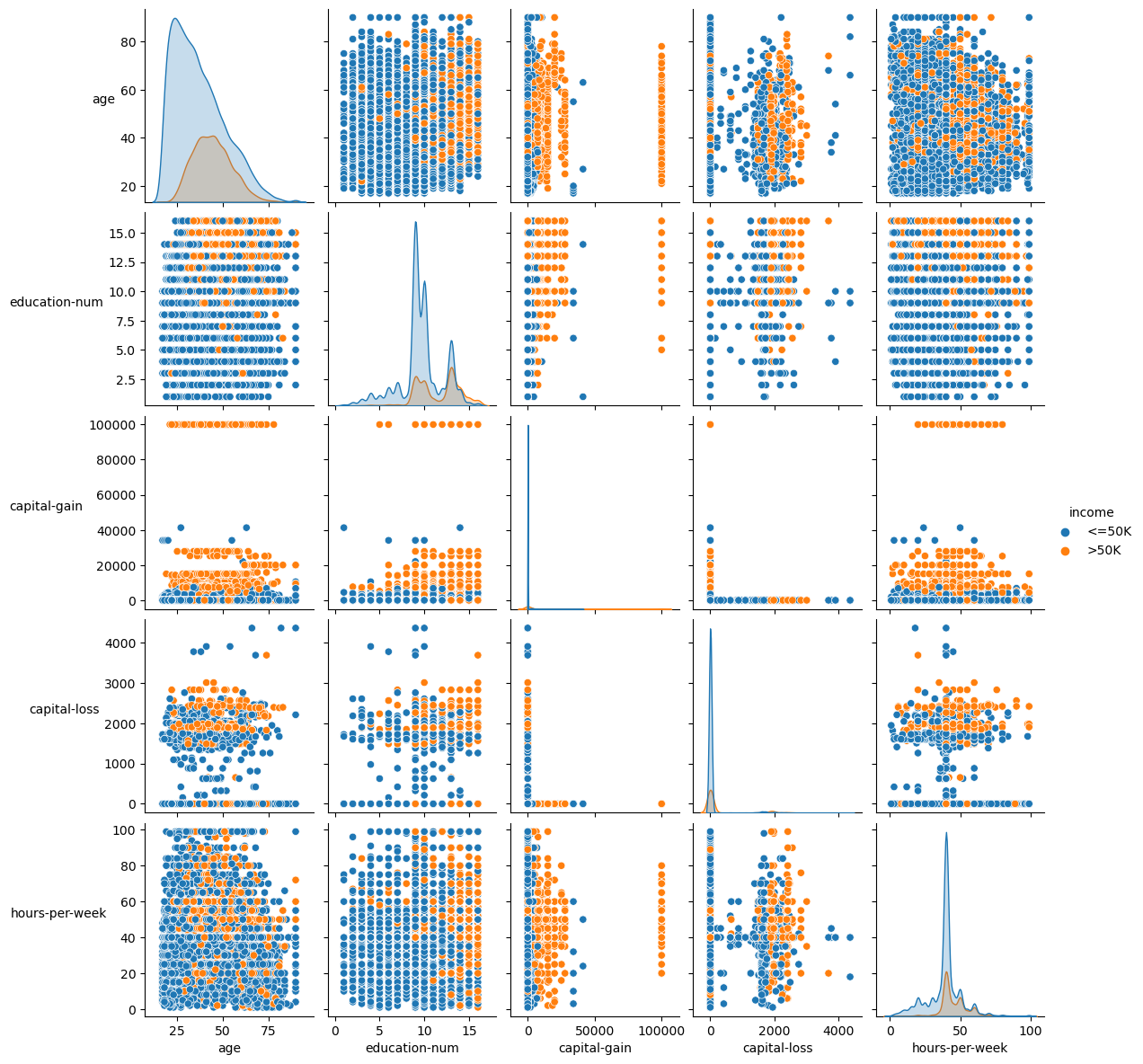
The pairplot gives a broad multivariate view of how the numeric variables relate to the two income classes. Higher-income observations tend to cluster around stronger education and capital-gain values, while the lower-income class dominates most of the overall space.
Pearson Correlation Heatmap
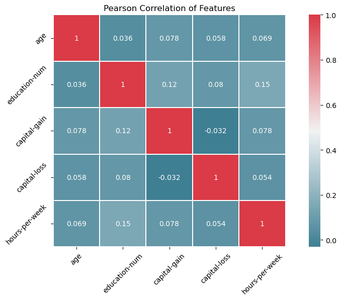
This heatmap helps show where the strongest numeric relationships live. It is useful for spotting which variables move together and for confirming that no single variable explains income strongly on its own.
Education Vs High-Income Share
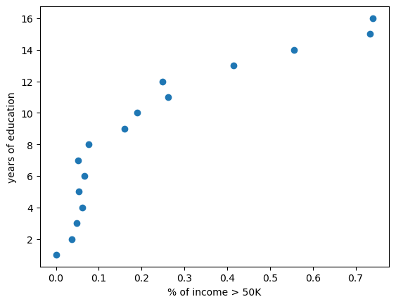
This scatter makes one of the clearest notebook findings easy to read: more years of education are associated with a larger share of >50K outcomes, reinforcing education as one of the strongest directional signals in the dataset.
Income By Education
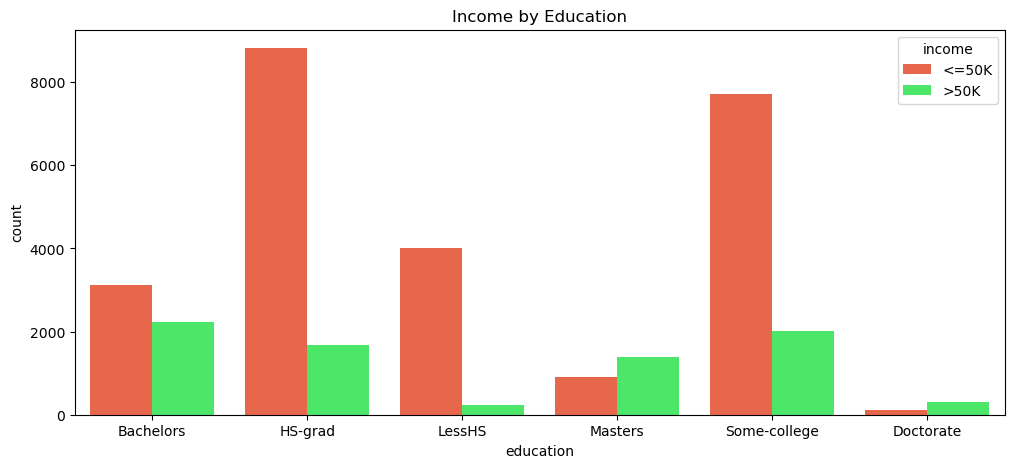
The education countplot is one of the strongest practical visuals in the notebook. It shows how strongly the income mix changes across education categories and why education deserves to be treated as a high-signal variable in this dataset.
Age Distribution
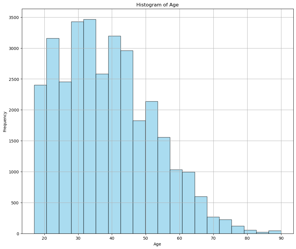
Most individuals fall between roughly 25 and 50, with fewer observations at older ages. That puts the strongest income patterns inside the core working-age population and gives the page a clear mid-career labor-market context.
Numerical Feature Heatmap
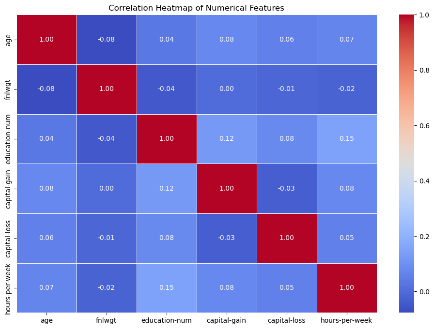
The numeric heatmap gives a tighter look at the purely numerical columns and complements the broader pairplot. It works well as a quick summary of which quantitative features are most closely tied together in the dataset.
Work Class Distribution By Age And Gender
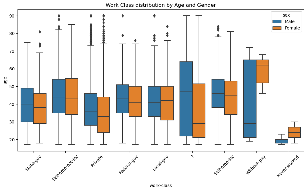
This view adds demographic texture to the income story by showing how age distributions shift across work classes and how those patterns differ by sex. The persistence of those differences suggests broader structural workforce patterns rather than role-specific noise.
Gender Statistics Summary
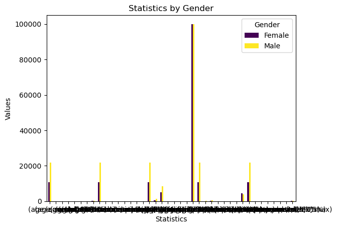
This plot reinforces the broader subgroup story: income-related differences between genders persist across the summary metrics, which suggests the pattern is systemic rather than limited to one narrow slice of the data.
The clearest conclusion from the notebook is that income differences are not explained by one single field. Education carries some of the strongest signal, capital gain becomes highly informative when it appears, and work structure, age, hours, and subgroup effects all contribute to the pattern. The dataset is most useful here as a map of where that structure already lives.
What stands out most is that income is driven by a mix of factors rather than one dominant variable. Education is one of the clearest drivers, and capital gain does a lot of separation work despite how rare it is.
At the same time, the weak correlations tell us this is not a one-feature story. Income here is better understood as the result of multiple variables working together across education, work behavior, and demographic structure.
Key Insights
Income Is Strongly Imbalanced
The dataset is dominated by the <=50K class, which means any later predictive workflow would need to handle imbalance rather than assume evenly distributed targets.
Education Is One Of The Strongest Drivers
Income increases significantly with education level, with advanced degrees showing a much higher proportion of individuals earning above 50K.
Capital Gain Is Rare But High Signal
Capital gain is highly skewed because most records sit at zero, but when it appears it becomes a strong distinguishing feature for higher-income observations.
Income Is Multi-Factor, Not Single-Factor
Correlation analysis shows that no single variable strongly predicts income, indicating that income is shaped by a combination of factors rather than one dominant feature.
Mid-Career Structure Dominates The Dataset
Most individuals fall within the core working-age range, which suggests that the strongest income patterns are being driven mainly by mid-career adults rather than very early or late career groups.
Gender Differences Persist Across Slices
The analysis shows a consistent disparity in income-related metrics between genders, with males more frequently represented in higher income brackets. That likely reflects broader structural factors rather than purely individual characteristics.
EDA Reading
The notebook begins with column naming, numeric/categorical splits, category counts, duplicate checks, null checks, and summary statistics. That creates a useful foundation for interpreting the later visual breakdowns instead of jumping directly into charts.
The education and income cross-tab outputs are especially helpful because they move beyond raw counts and show within-category income proportions.
Analytical Reading
This is best read as an exploratory demographic income study rather than a modeling notebook. The strongest value comes from showing how income composition changes across education, age-related structure, and work-class distributions.
The page is useful because it surfaces where the strongest signal already lives: education, capital gain, work structure, and demographic subgroup effects.
Why These Patterns Matter
Education Is A Major Income Driver
Higher education levels are much more strongly associated with >50K outcomes, making education one of the clearest directional signals in the dataset.
Capital Gain Is Rare But Powerful
Capital gain appears infrequently, but when it does it becomes one of the strongest distinguishing features for higher-income individuals.
Income Is Multi-Factor
No single variable explains income strongly on its own. The real structure comes from several weaker factors working together across education, work, hours, and financial variables.
Gender Differences Are Structural, Not Isolated
The gender differences persist across income levels and work-class views, which suggests the pattern is broader than any one role-specific slice.
Notebook Trace
Column Cleanup
The notebook starts by naming columns, separating numeric and categorical data, stripping spacing from category labels, and checking duplicates and missingness.
Descriptive Profiling
Summary statistics, grouped summaries, and category value counts establish the income and demographic structure before visualization begins.
Visual Relationship Review
Histograms, density plots, box plots, scatter plots, pairplots, and heatmaps are used to identify how features shift across income levels.
Income Composition Check
Cross-tabs and education-focused income visuals close the notebook by showing where the high income share concentrates most clearly.
Project Highlights
Large Structured Census Dataset
Works with over thirty-two thousand rows spanning demographic, education, occupation, hours, and capital-related income features.
Income Composition Analysis
Breaks down the <=50K and >50K split across education and work-related structures to show where higher-income outcomes become more concentrated.
Feature Signal Discovery
Uses pairplots, scatter relationships, and heatmaps to identify which variables carry meaningful directional signal for income differences.
Model-Ready Framing
Frames the dataset in a way that naturally leads into later classification work, including class imbalance awareness and categorical cleanup considerations.